Mittwoch, 17. November 2010

ITAP 6/Production & Outcomes/ influence & reactions

As we've learned in this Itap lecture the Illustrators time and place has great effect on the content and outcome of a work. The word for this point is called "Zeitgeist" which describes the spirit of the time. The following examples shows how the the "Zeitgeist" influenced Illustrators, Directors and Costume Designers.
We all know Batman who changed throughout time. Batman changed his appearance during time. The oringinal comic figur of Bob Kane is muscular and wears a grey costume with a yellow belt. the mask and the cape are black and blue. 
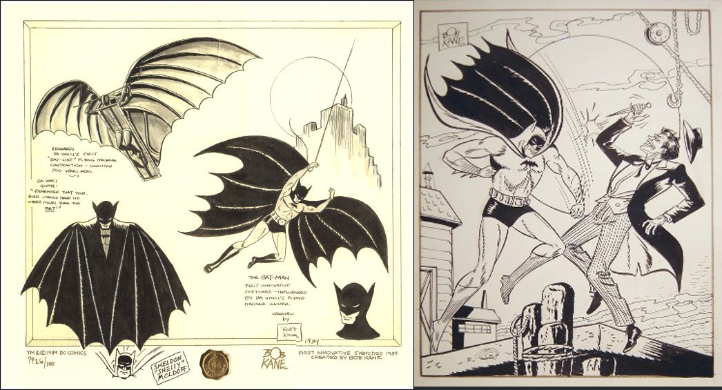
Scatches of Batman by Bob Kane


Batman Comic Cover by Bob Kane


In the Batman series of the sixties the style of the hero and it's helper Robin kept in the Comic style.


Also the look of the Film from the 60's combines the comic style and very much the spirit of the time. The bright colours of the scenery and the costumes fit into the era.
In the late 80's early 90's Batman was made into another film by Tim Burton. The main character is darker than the film in the 60's but the figures are kept overdrawn. The spirit of a time can be recongnized by things like the hairstyle of actors. Have a look at the Michelle Pfeiffer's haircut and the oversized blazers which were modern by then.


The newest interpretation of Batman is in a some points different. The Director Christopher Nolan created a Batman who was never that dark and serious. Much more violence is involved and the villains remind of psychopathic killers.

Batman's costume changed to be more like a knights armour. Completly black and dressed in a futeristic knights armour ready to fight against evil.


ITAP 5/ Development of Ideas and Structure in Moving Image.

In this ITAP lecture we got tought about movie structures, how to develope a story and a character.

I chose to explain the film "I've loved you so long" which is an independent film from France, written and directed by Philippe Claudel.


The film is about the live of a middle-aged woman called Juliette (Kirsten Scott Thomas), who deals with guilt, punishment and judgement being released from prison after a 15 years sentence. The film describes her way to rehabilitate and to obtain redemption.

The structures of movies are in a 3 act structure; Beginning: middle: end, with no need to stay in the same order.  In this movie 3 act structure is shown but not as in movies where theres a hero solving a problem and a happy ending is predictable.
"I've loved you so long" is almost in the same consistent atmosphere. Nevertheless, beginning, middle and end can be found in this example.

In the first act Juliette is collected at Nancy airport from her sister Léa. Juliette came to stay with Léa who lives in a house with her husband Luc, his father and their 2 adopted daughters. After the arrival of Juliette, Luc and Lea have a discussion about Juliettes stay and by then the audience knows she was in jail for murder. The mystery what the reason of her sentence is hidden.
Luc is supersticious about the moving in of Juliette and fears the safety of his children. The audience soon discovers she was in jail for the murder of her six-year-old son.

The second act is about the confrontation with society. She tries to find a job and isn't surprised to be avoided by some interviewers. Having been abondend by her parents, friends and society, Lea is at first the only one who stands behind her with termlessness and persistance.
Juliette soon finds a friend in her social worker and gets introduced to Michel (Laurent Grévill) who is a collegue of Léa. She relys on Michel who used to work in jail. She finds out that her social worker who had depressions took his life.

In the third act Juliette slowly starts over again and gets a daily routine. She starts to enjoy life in generel through work, reading, visiting art museums with Michel and meeting friends of Léa.
The mystery of Juliette's action reveals through her sister who accidently finds a laboratory report and a picture of her nephew. This report shows that Juliettes son had terminal cancer. Léa confronts Juliette with what she had found. In the end Juliette tells her story.

Juliette as the Protagonist/main character is a very reserved, chain-smoking middle aged woman. She radiates grief, hopelessness and seems to be unpredictable.  The Antagonist is also Juliette because she causes the conflict in the family. She stands in a constant conflikt to herself and to others. The charakter is not trying to explain or to find any excuse by her actions. She doesn't expect people to understand her because one way or the other she was guilty.


ITAP 4/ Reflective Visual Journey

The way a Visual Communicator comes up with their ideas, is to do something at first. A white paper wont give an answer and so it is important to experiment. We learned that the right brain is like a child at play- playful, curious and innocent.
The left brain is clarifying, organising, editing, selecting what was done.  What do we see? What does it mean? What is useful?  Both brainparts are constanly operating together. A Visual Communicator starts to do something in the RVJ with an intention. An idea needs to develope and can start of in many different directions. The outcome is not the most important whearest the way to the final piece creates further ideas.  Awareness of how the 2 halfs act together can help us to create something and helps to allow ourselfs to experiment at first and not to be bigoted. 

The first brief i received had the titel "looking at the Overlooked". To explore the locality of Birmingham from a different aspect and show a wide range of different techniques. I went to Digbeth the industrial area of Birmingham and took fotos of singns and buildings. Birmingham to me is an interesting city that needs
to be explored.  Below you can see pages of my RVJ where you an see a picture of a sign taken in Digbeth. Not the typography caught my eye, it were the squares around it that reminded me of stiching. I started stiching random forms which you can describe as being playful and experimental. Some of the forms developed to be letters. Also transparacy paper was used and the effect of being see through had an interesting effect. The effect to see how it is done, the unperfect  look of it.

Melox Marvels sign in Digbeth
The forms below the letters reminded me of stiching.


letterform through stiching, by Christiane Matz

stiching on transparant paper, by Christiane Matz

The word unexpected came into my mind. Birmingham is often "overlooked" just like the brief described it with it's title. The first buildings i saw were at new street which are grey and full of old high-rises. Behind all these grey buildings are beautiful victorian houses are hidden. The architecture is multi-facated and therfore interesting. A lot of constructions are going on in birmingham so that the "undone" stiching look  works very well for this projekt. also the fact that it is an instalation which needs light so you can see all of the lines has an unexpected effect to it.

The final outcome, by Christiane Matz


Montag, 25. Oktober 2010

ITAP 3/ Visual hierarchy and Tone of voice

We all know terrible websites where you can not find the information you need. In this blog entry I'm happy to show 2 good examples of webdesign with different content. The site http://www.thebestdesigns.com/ posts a lot of good designed websites. The site below http://off.foxbone.fi/ is about an independent filmfestival. It gives filmmakers a chance to show their work. The target group are mostly people who study film or have an interest in independent films.
The style of the menu bar is an eyecatcher and combines a mix between old and new. Looking at the visual herachy, the first thing that catches my eye is the menu bar which is in the "Retrostyle". First it seemed to be chaotic but through the different colours it gets clear. On the left you see the Logo of the Filmfestival, followed by News, Apply, Programm and so on. The Layout is not overloaded and gives a young impression through it's style.

October Filmfest Website


Another good example is a site which sells baby items, http://www.mummade.co.nz/. The tone of voice is very soft. The pastel colours and the typeface fits perfectly to the content. The advertiser shows right away that his products are handmade. Take a look at the Logo which has a handwritten "... with love" added to it.  It shows straight to the point, these products are different to massproduction. The customers are parents who appreciate good service and quality.  Whereas the products are made by mothers, the confidence base of the customer rises. To sum up, this website is clear and the design is suitable to the content.


Mum Made ... with love Website

Thanks for reading.


Reference

ITAP 2/ Research and Development from an Illustration perspective


Illustrators need to surround themselves with things they inspire. That was one of the phrases which got stuck in my mind from the 2. ITAP lecture. Everyone needs some kind of inspiration before they start their research. To me music, film and traveling creates my muse. 

I started to develope an interest in Silent Films and the era of the Roaring Twenties. I‘m fascinated by the excessive gestures of the actress/actors and the fashion, make up and hair. It is interesting how the light was set and how emotions were shown without any talk. Nowadays Silent Films seem so rough compared to all the new techniques of filmaking.  


Also Stop-Motion Films such as Coraline caught my eye. The fact that most of it is handmade is so unique.  Of course a film like Coraline is mixed with newest techniques, but the fact that most of it was made by hand is amazing. The love for the details and the passion for the figures is overwhelming. In an age where everything can be done with the help of computers, a film like that stands out.  Watch a part of the "Making of Coraline" and you will see what I mean. 


I came to the point to create my own Stop-Motion film and mix it with the style of Silent Films. To design a character I looked at actresses of the Twenties and Louise Brooks style was so perfectly clear, that it seemed obvious to choose her as a model. She was an outstanding actress who was ahead of the time she lived in.  Brooks was different from the others and her uncompromising style and acting brought up an icon. 


I found one of her films on youtube called "Diary of a Lost Girl".  Here is the first part of it.


My first Stop-Motion Film turned out to be an experiment with different materials. The story came while crafting the figure and the room she lives in. All the sudden I started searching for things in my environment which i could use in another context. A thimble turned into a showerhead, cotton wool turned into foam, clingfilm into water and a yoghurt pot became an armchair. 


The characters extremeties were seperate and the room was made of styrofoam, so that I was able to pin the figure into the scenery. To change her facial expression, I put on snippets with removable glue.


Another character is Oscar, who was inspired by Oscar Wildes "Dandy-look". Brooks and Wilde had similarities because of being ahead of their time.  


To me it was clear that the main character Louise should be coloured. The story is about a woman who's different from the others. She is the only one of her kind in a cold blue world where everyone's the same. When the only person who used to accept her just the way she is left, it was time for her to move on.

I hope you enjoy the film and thank you for reading my blog.


Reference: youtube, my own

Montag, 4. Oktober 2010

ITAP Connectivity

Gustav Klimt who was an Austrian Symbolist painter was one of the most important artists of Art Nouveau. In his days his work was like a decleration of war to the classic ideal. Though most of his work was called pornographic, he was celebrated of the Viennese society. Klimt joined the 
"Wiener Sezession", which was a contigent of artist who protested the classic ideal and theory, willing to bring the best international artwork to Vienna.  At this time the rebellion against censorship of artwork was not only an important advancement for the art scene, it also showed an openness to sexuality and thematised the aspiration and fear of his time. The age of Industrialisation had an impact on economy and society and new Issues appeared. A new era began, so Klimt symbolized the questions, desire and fear.


Though the leitmotif of Klimt's work was mainly about sexuality and the female body, another important fact is that beauty and vitality of his paintings were in contradistinction to death. You can see below one of his paintings:"The Tree of Life". As it's name says, it stands for Life itself; reaching for Heaven and linking to "Mothers Erath".  The tree stands for life, death and resurrection. It is a symbol found in many cultures.


The Tree of Life
Gustav Klimt
Who inspired Klimt? He was intensely interested in Viennas elegant prints and found organic forms through nature. His artwork was influenced by the Byzantine mosaics of the St. Vitale church in Ravenna which he visited. As shown in the example below, "The Tree of Life" ornaments and the use of gold reminds of the Peacock mosaic. The Peacock stands for paradise and resurraction, which a similarity to "The Tree of Life" painting. Inspired by the Byzantine images, Klimt addapted their style contempory in his time.

Byzantine Mosaics
Also other cultures inspired Klimt, like the egyptian culture. The "horus eye" which stands for eternity. It can be found in the branches of the Tree. 

How does Gustav Klimt's work takes influence nowadays? The interwine of a classic and modern style, meaning the combination of realistic faces surrounded by two dimensionality,  is timeless. A spanish photographer called Moises González reproduced Klimt's golden phase for  the magazine "Ae". The image structure, elements and the context stays the same. Moises González takes the Art Nouveau into modern times.


Above: Danae by Gustav Klimt


Above: Moises González‘ version of Danae


Above left: Judith 1 by Gustav Klimt and right; Moises González‘ version